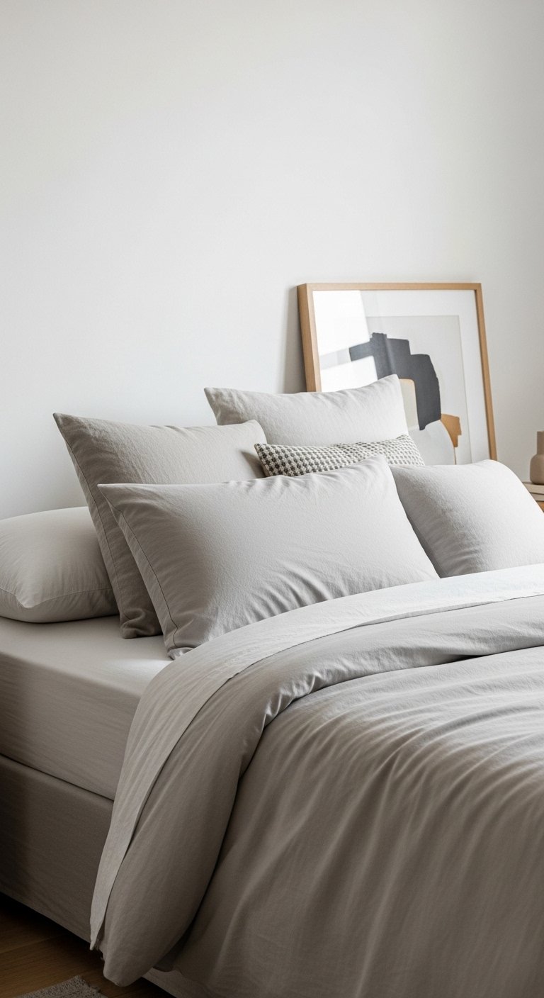
A real, lived-in bedroom showing the final result of how to create a purple bedroom theme that feels cohesive and stylish. Natural daylight, soft shadows, layered textures. The space feels intentional but not staged. No text overlay. Wide angle that shows balance and flow.
I once painted a wall purple and still felt like the room didn’t belong to anyone. The color looked pretty but the space was awkward. I kept moving pillows and art and nothing fixed it.
I learned that purple needs a plan. It’s about where the color lives, how much, and what it rests against.
How to Create a Purple Bedroom Theme That Feels Cohesive and Stylish
This is the method I use every time a room feels unfinished. I show how I anchor purple with a main piece, balance it with neutrals, and layer texture and small accents so the bedroom reads cohesive and calm. The room ends up intentional, not forced.
What You’ll Need
- Plum Velvet Duvet Cover (Queen, deep plum velvet)
- Light Gray Linen Curtains (84-inch pair, natural linen look)
- Neutral Patterned Area Rug (8×10, wool blend, beige with muted purple accents)
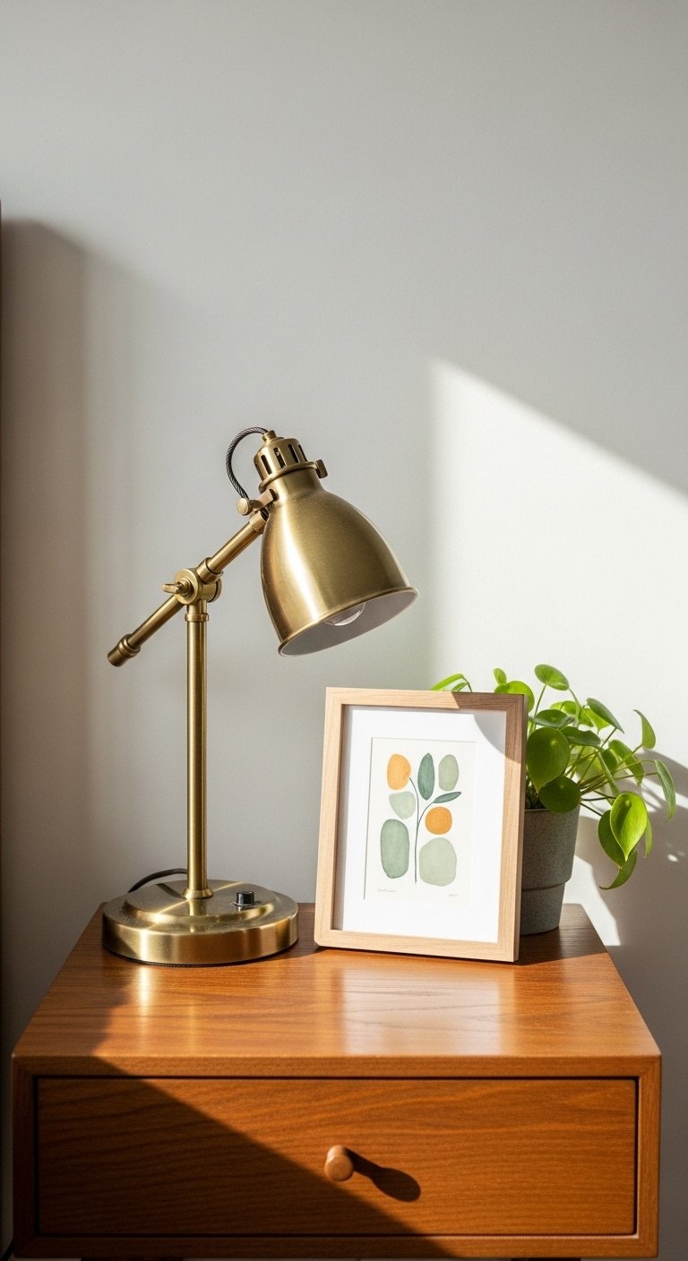
- Brushed Brass Bedside Lamp (18-inch metal base, warm finish)
- 5-Piece Gallery Frame Set (walnut wood, mixed sizes)
- Lavender Knit Throw Blanket (50×60 inch, cotton blend)
- White Cotton Sheets (Queen, 400-thread count percale)
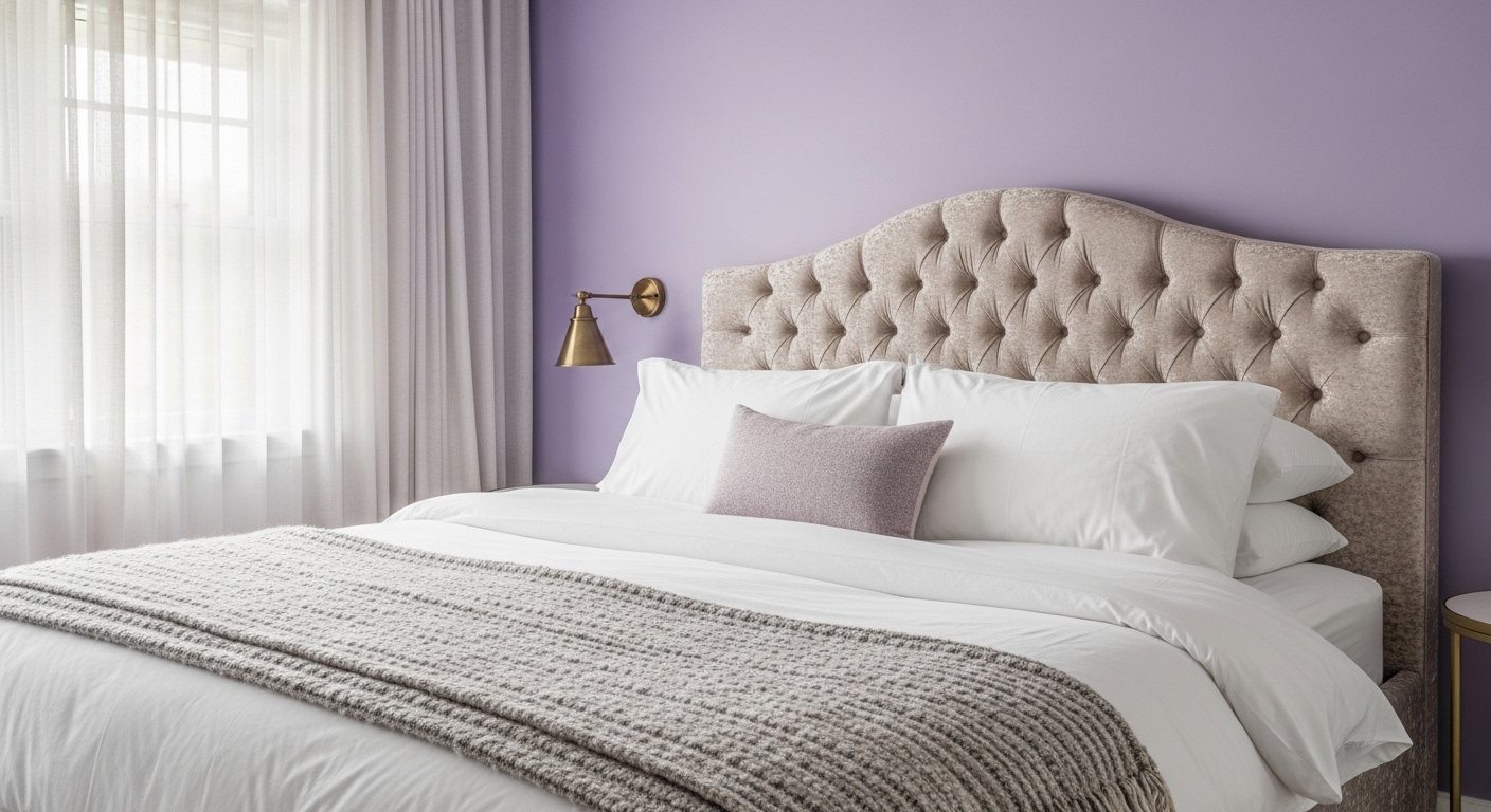
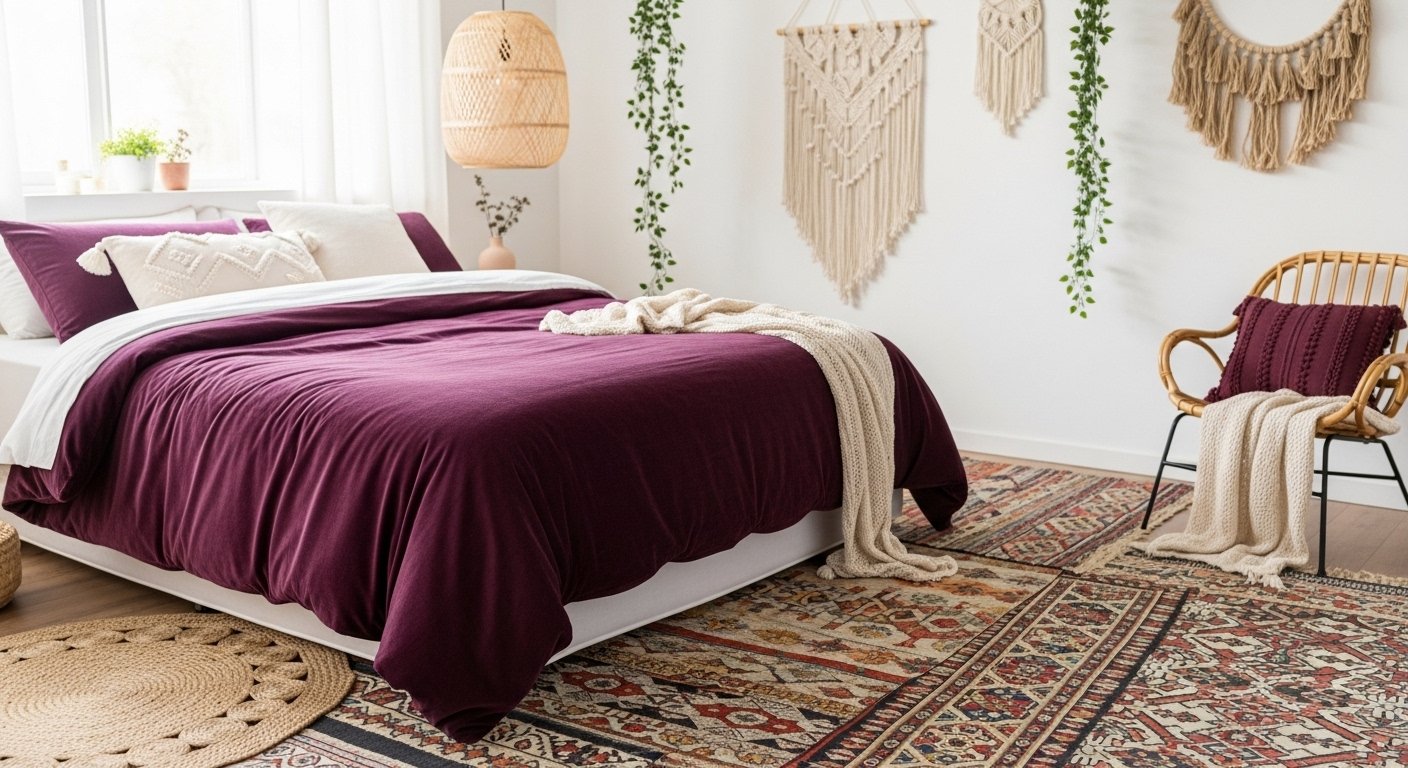
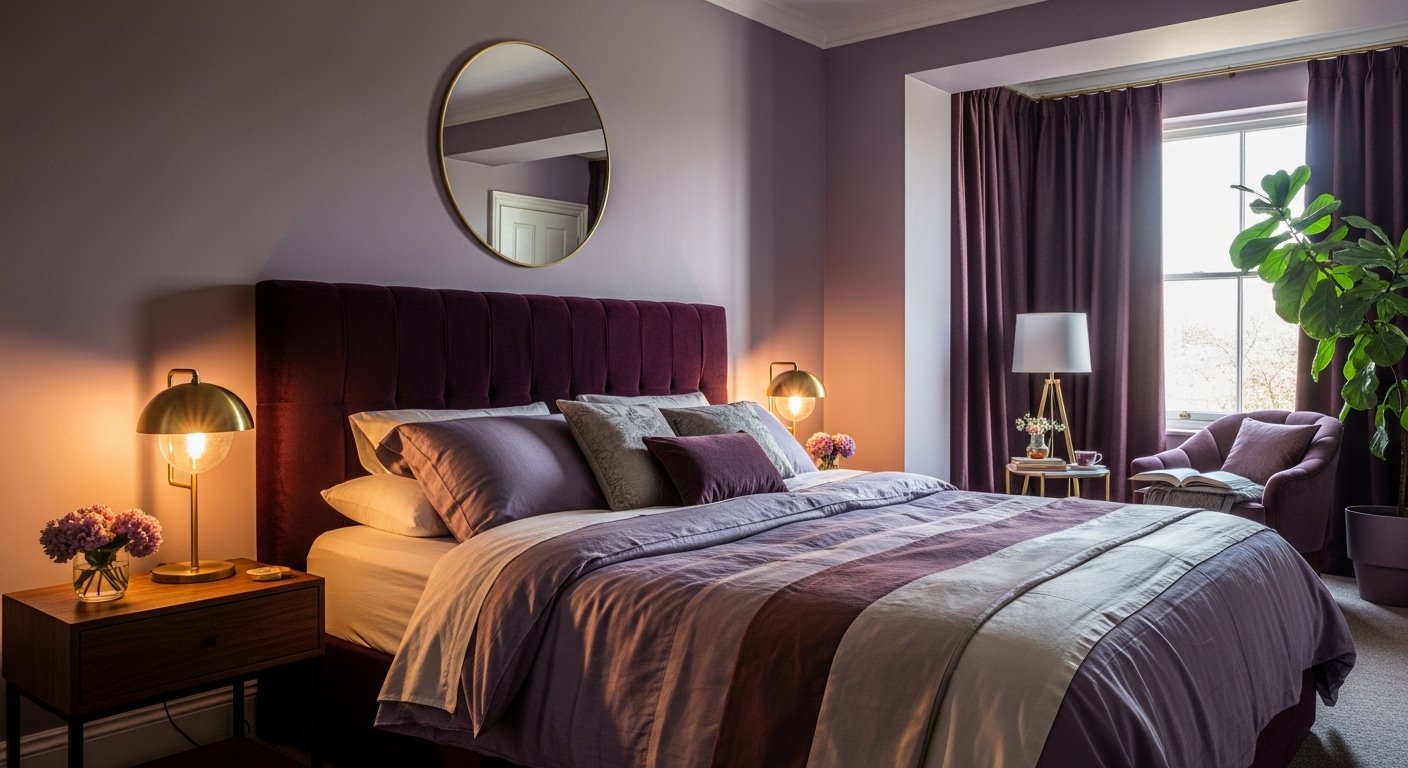
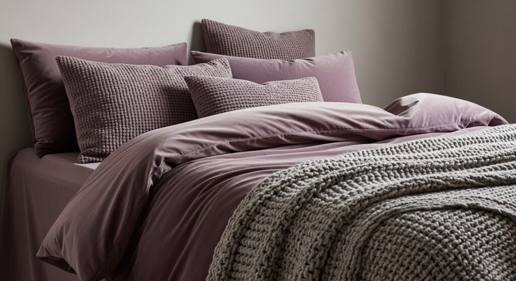
Step 1: Choose a Single Purple Anchor
I start by picking one dominant purple piece. For me that’s usually bedding. Picking the duvet first tells the room what purple means here — rich and cozy or soft and airy. The visual change is immediate: the eye has a place to land.
A common miss is trying to make everything purple the focal point. The small mistake is matching every shade exactly. I keep other purples as accents, not competitors.
Step 2: Set a Calming Neutral Field
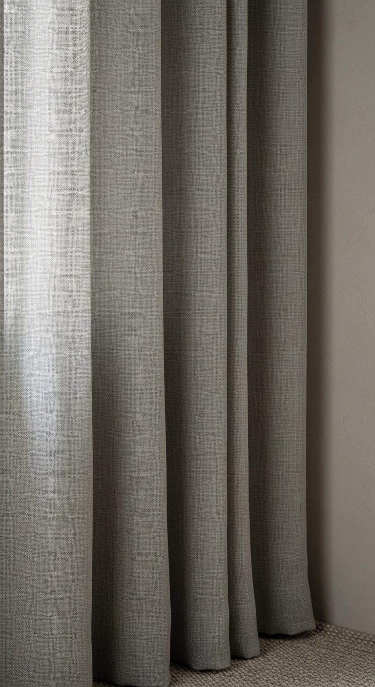
After the anchor, I decide the neutral field: walls, curtains, or the rug. I usually stick to light gray or warm beige so the purple reads clean and calm. Visually, the purple breathes against this backdrop instead of fighting it.
People often miss that neutrals aren’t boring — they’re the canvas. A mistake I make sometimes is choosing a neutral that’s too dark; it makes purple look heavy. I aim for contrast that feels balanced.
Step 3: Layer Textures to Keep Purple Warm
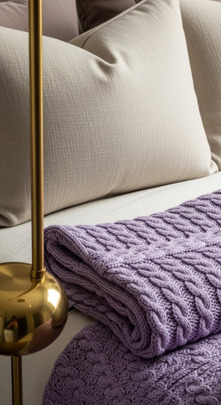
I add texture next. Velvet, linen, knit, and a metal lamp give the purple depth. The room stops feeling flat and more lived-in. The visual change is subtle but it makes purple feel intentional and warm.
One insight I learned is that texture is how purple becomes cozy rather than loud. The mistake to avoid is using only one fabric family — all velvet or all cotton looks predictable. I mix scales and finishes.
Step 4: Repeat Small Accent Colors and Patterns
I pick one or two secondary colors and use them sparingly — a muted green, soft ochre, or warm terracotta. I repeat those accents in art, a rug detail, or a plant pot so the room reads unified. The visual change is rhythm: my eye keeps finding the same notes.
People miss the power of repetition. The small mistake is introducing too many unrelated accent colors. I limit the palette and repeat it three times in different spots.
Step 5: Edit, Live, and Adjust
I live in the room for a week before I call it done. I shift pillows, move a frame, and notice what feels off in real life. The visual change is subtle refinement — symmetry, scale, or a missing layer.
Most people try to finish in one go. The mistake I used to make was over-accessorizing too quickly. I edit down until the room feels comfortable and intentional.
What This Solves
I fix the scattershot purple approach that makes a room feel busy or confused. The method keeps purple from dominating by giving it clear roles: anchor, accents, and texture. It also solves mismatched purples by enforcing one main tone and small, repeated accents. The result is a calm, cohesive bedroom that feels lived-in.
Choosing the Right Purple
I think about mood first. Lavender reads soft and airy; plum feels cozy; eggplant is dramatic. I pick a shade based on the room’s light and how I want to feel there. If light is limited, I lean lighter. If the room is sunny, I can go deeper.
Quick guide:
- Lavender: good for bright, small rooms.
- Plum: cozy, works well with warm woods.
- Eggplant: best as an accent or on one wall.
Lighting and Mood
I use warm bulbs and two light sources per side of the bed. A bedside lamp plus ambient light softens purple into something friendly. Natural light changes purple all day, so I check the room in morning and evening.
Practical notes:
- Use 2700–3000K bulbs for warmth.
- Place lamps at the same height for balance.
- Dimmer switches help the purple settle into the moment.
Final Thoughts
Start with one purple piece and one neutral field. I find that tiny, repeated accents and lived-in textures make the biggest difference. Edit slowly and live with the choices for a few days before adding more. Small changes add up to a room that feels intentional and comfortable.