I used to stand in my small purple bedroom and feel boxed in. The color made me happy, but the room felt heavy and crowded no matter how I moved things.
I learned to treat purple as one voice in the room. Small edits to scale, light, and surface choices let the color breathe and make the space feel calm.
How to Decorate a Small Purple Bedroom Without Making It Feel Crowded
This is the method I use every time a room feels too full. You’ll learn how to keep the purple you love while making the room feel open, balanced, and lived-in. The result looks intentional, relaxed, and comfortable—without adding more stuff.
What This Solves
It solves that tight, “painted-in” feeling purple can cause in small rooms. I focus on breathing room, clear scale, and purposeful surfaces.
You’ll stop layering competing textures and start editing so the color reads as cozy, not overwhelming.
What You’ll Need
- White sheer linen curtain panels, 52×84 inches
- Neutral jute area rug, 5×8 natural fiber
- Wood-framed leaning mirror, 60×20 dark oak
- Slim wall-mounted nightstand, white floating shelf
- Brass adjustable task lamp, matte brass
- Lightweight platform bed frame, low-profile oak (queen)
- Neutral textured throw pillows, 18×18 linen mix (set of 3)
- Open wall shelving unit, slim white metal 24×72
Step 1: Choose the bed placement that creates breathing room
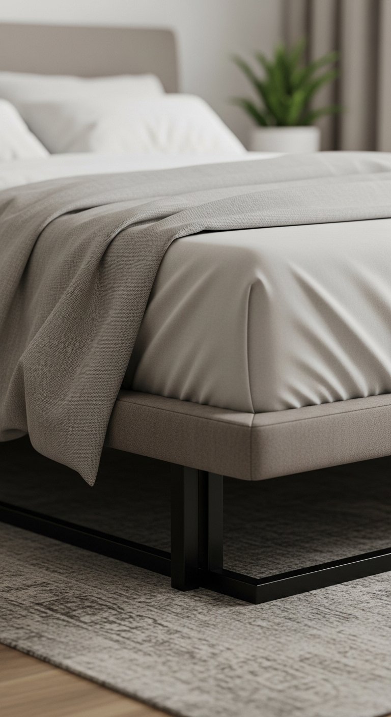
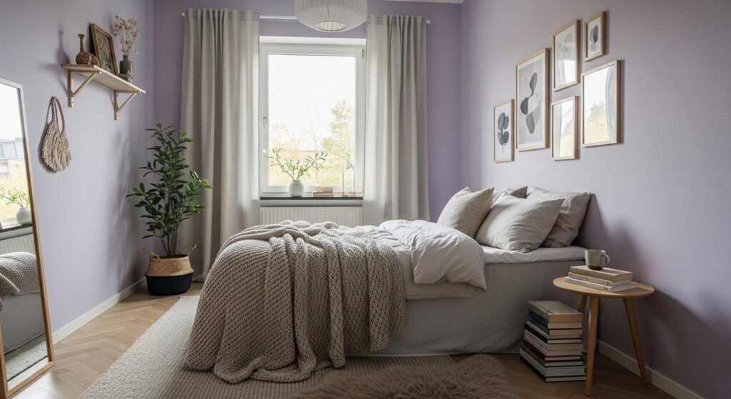
I start by placing the bed where you can walk around it easily. In a small room that often means a low-profile platform bed pushed slightly off a wall, not jammed into a corner. This choice immediately changes the feel — the room reads as intentional and open.
Most people miss how circulation shapes perception. If you can pass the bed without brushing a surface, the space feels larger. Avoid the mistake of centering everything if it blocks a natural path.
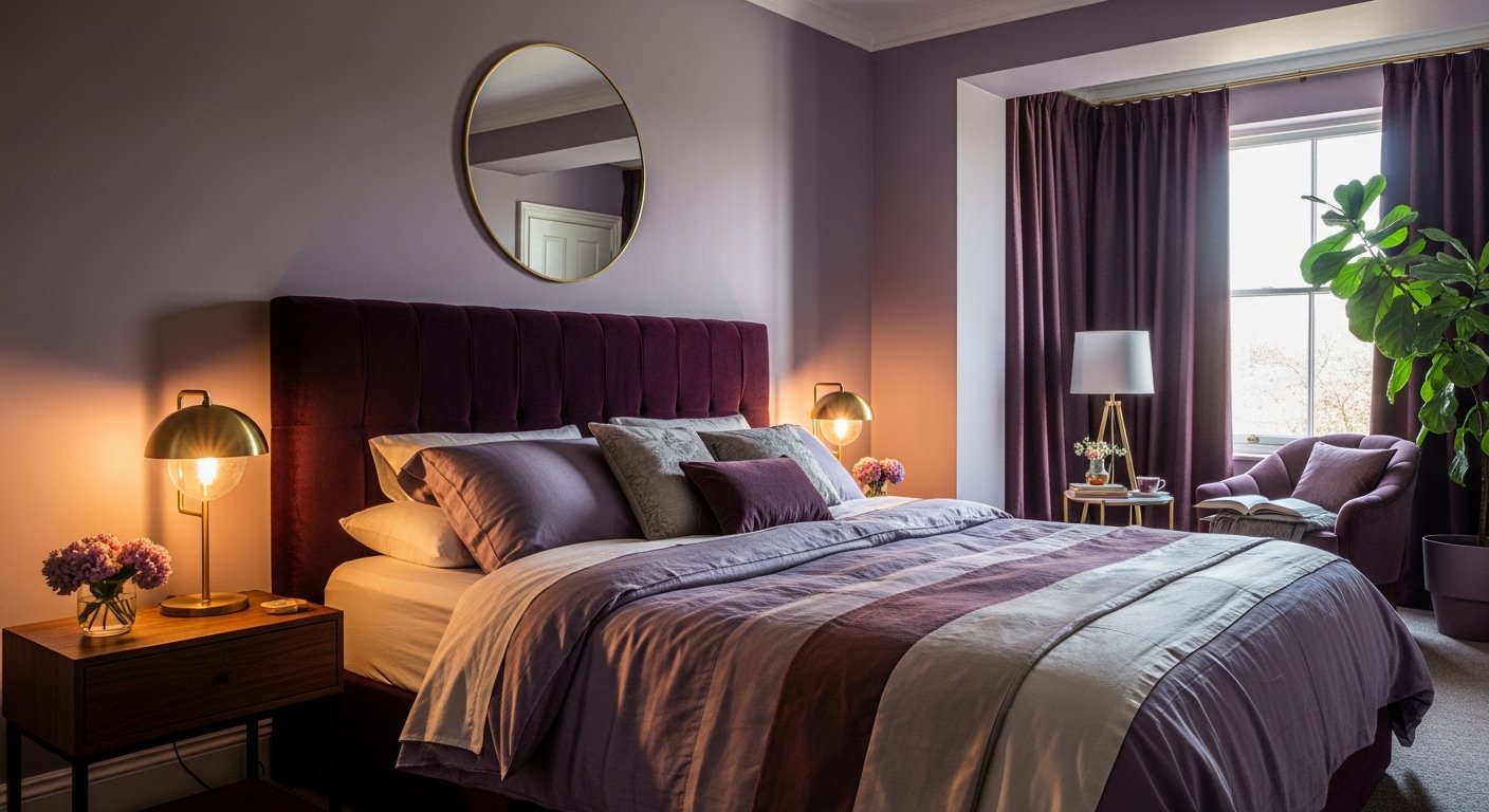
Step 2: Anchor the color with neutral grounding pieces
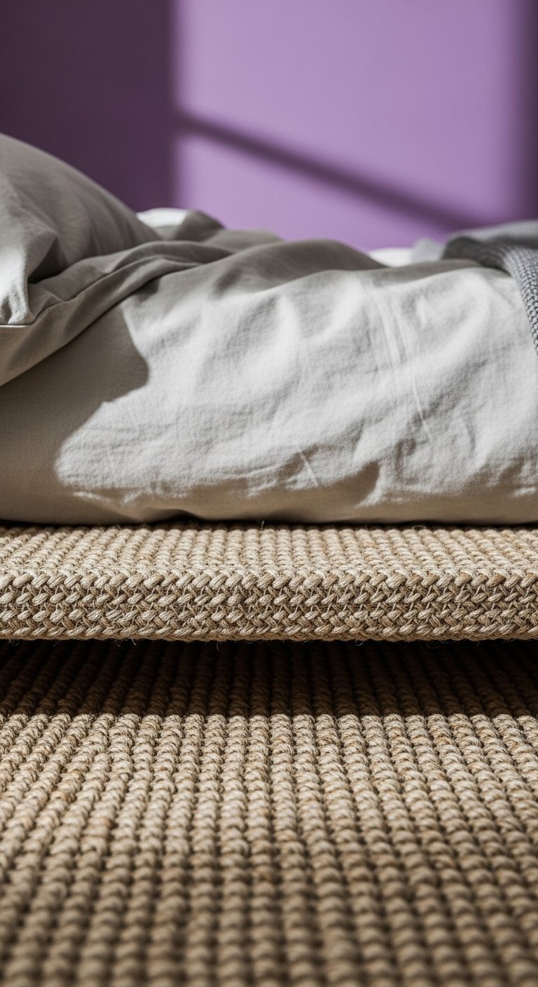
I always add a natural rug and a simple bed frame to give the purple something to sit on. A jute rug and a light oak platform quiet the saturation and keep the eye moving horizontally rather than stopping on the wall. The room instantly reads calmer and more balanced.
People often pile on more color to “match” the walls. The insight is that grounding neutrals let purple work as a feature. A common mistake is a heavy patterned rug that fights the wall — it makes the space feel busy.
Step 3: Use light fabrics and a mirror to open sightlines

I hang white sheer curtains to diffuse light and lean a tall mirror to reflect it. Sheer fabric softens the purple’s edge and a leaning mirror adds depth without bulky furniture. Together they brighten the room and make walls feel set back a bit.
Many people forget the power of subtle reflection—glass unlocks depth without adding items. Don’t use a small mirror tucked on a shelf; it won’t change scale. Also avoid heavy, ornate mirrors that add visual weight.
Step 4: Edit furniture and lift surfaces visually
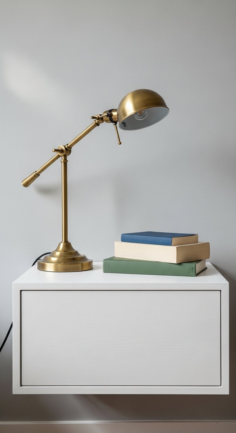
I swap bulky nightstands for a slim floating shelf and choose open shelving instead of closed cabinets when possible. Lifting pieces off the floor and keeping legs visible keeps the room airier. Fewer, smaller surfaces reduce clutter and help purple remain the accent, not the anchor.
An insight: empty wall space is deliberate design. The mistake is filling every surface to “complete” the room. Leave some air — it reads as calm, not unfinished.
Step 5: Layer cushions and light without competing patterns
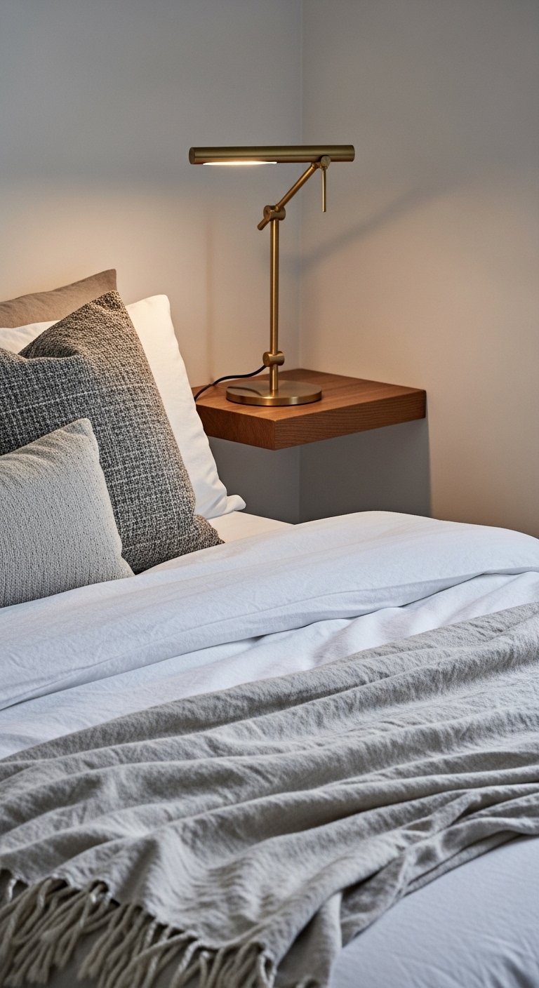
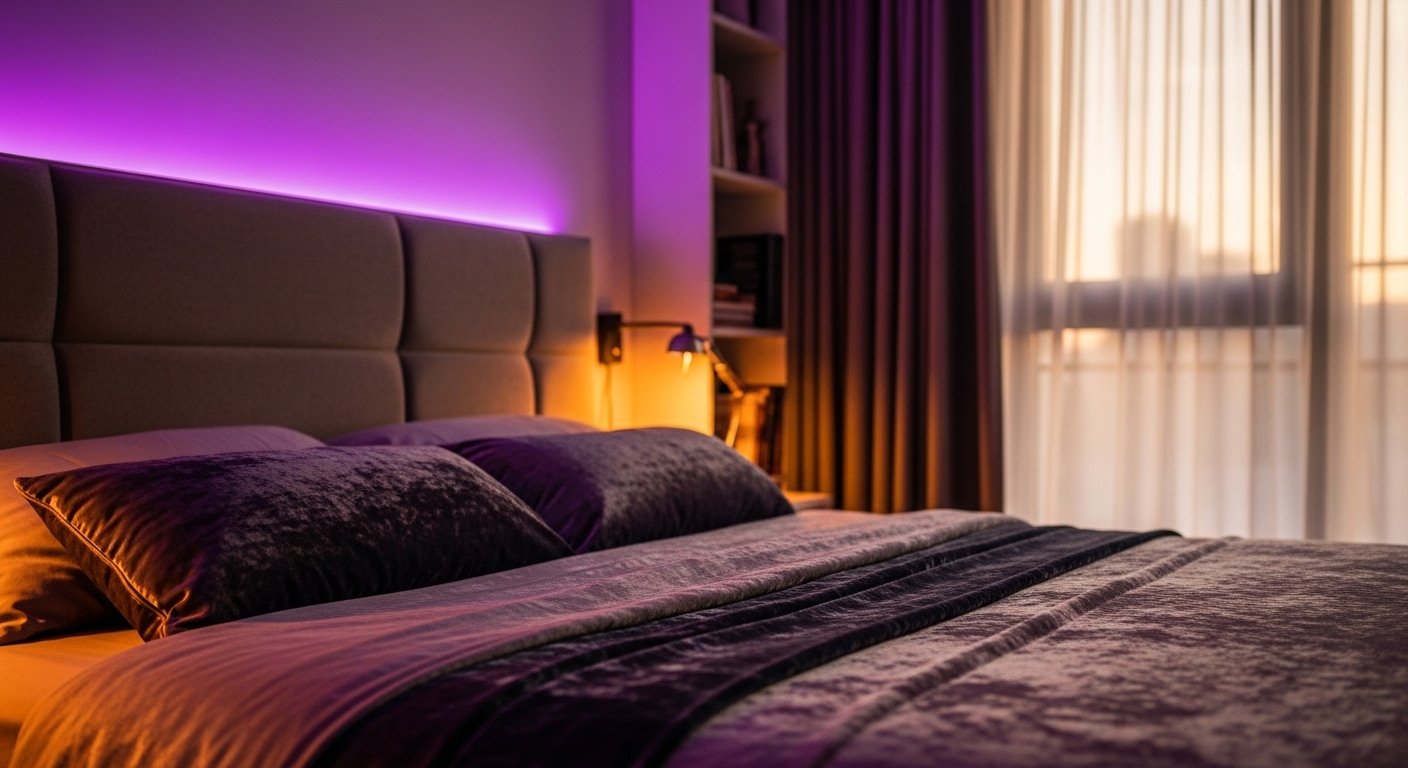
I finish with a few textured pillows and one soft throw to add warmth without noise. I place a small brass task lamp on the floating shelf for focused light and a cozy glow. These layers make the purple feel purposeful and comfortable instead of loud.
People often add many patterned pillows or oversized art and it competes with the wall color. The insight is restraint: choose texture over pattern. Avoid mixing too many colors — let the purple sing with quiet companions.
Lighting and Rhythm
I keep lighting varied but subtle. Daylight, a bedside task lamp, and a soft overhead (or wall sconce) create layers without cluttering surfaces. I aim for warm bulbs and dimmable options so the purple reads different through the day.
Rhythm comes from repeating small elements: the same metal finish, a consistent pillow size, or a matched set of floating shelves. Repetition steadies the eye in a small space.
Smart Storage That Breathes
I favor open shelving and low-profile storage that shows a little breathing room between objects. Baskets on lower shelves hide clutter and keep visual noise low. The idea is tidy, not sterile.
Use vertical storage sparingly. Taller pieces pull the eye up and make the room feel taller, but they must be slim and light-colored to avoid crowding.
Color Balance and Finishing Touches
I treat purple as the feature, not the whole story. Add two neutral tones (wood and natural fiber, for example) and one metallic accent to balance warmth and lightness. Small plants or a single piece of art add life without competing.
Final details matter: consistent hardware finishes, coordinated textiles, and edited surfaces will keep the room feeling intentional and calm.
Final Thoughts
Start with one small change: move the bed or swap a heavy rug for a neutral one. You’ll see the room breathe immediately. Small edits build on each other.
Be patient and edit ruthlessly. A calm purple room is possible with careful placement, light, and restraint.