I used to stand in my bedroom and wonder why the purple felt heavy or juvenile. The color was right, but the room didn’t feel finished. It was the kind of “almost” that makes you avoid guests.
I learned to treat purple as an anchor, not the whole story. Small changes in placement and texture made the room feel calm and intentional.
How to Style Purple Bedroom Decor for a Modern Pinterest-Worthy Space
This is the method I use every time a room feels like it’s missing something. You’ll learn how to make purple read modern and calm, not busy. The end result is a balanced, lived-in bedroom that photographs well and feels comfortable to live in.
What You’ll Need
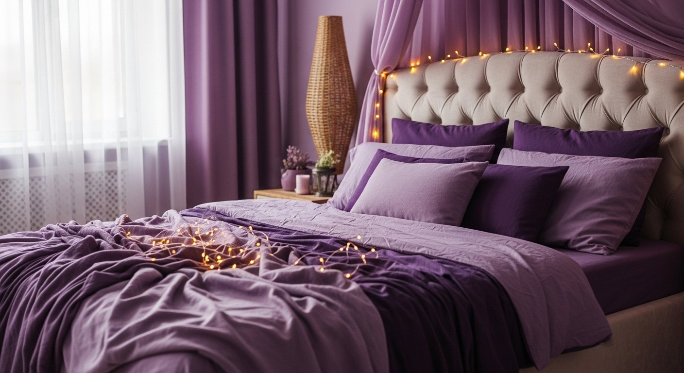
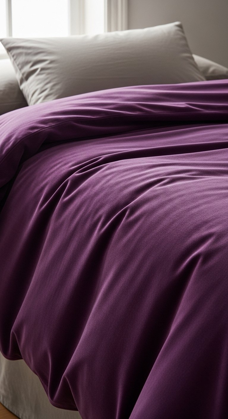
- Deep purple velvet duvet cover (queen size, charcoal-purple)
- Soft lavender knit throw blanket (50"x60", cotton-blend)
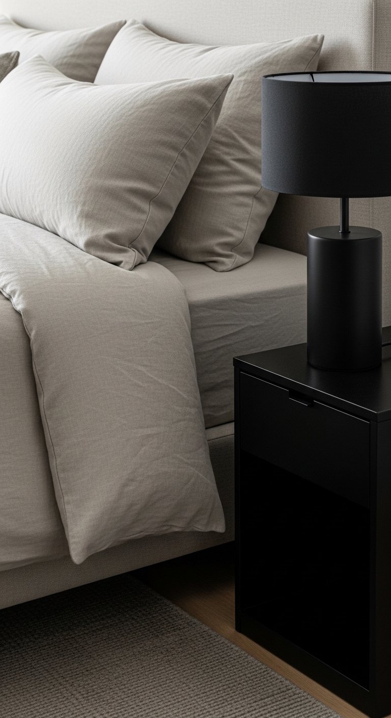
- Neutral linen pillow shams (set of 2, taupe)
- Matte black bedside lamp with fabric shade (18" height)
- Large neutral area rug (8'x10', low pile, warm gray)
- Set of brass picture frames (gallery size mix)
- Sheer white linen curtains (pair, 84" length)
- Glazed ceramic vase (matte white, medium)
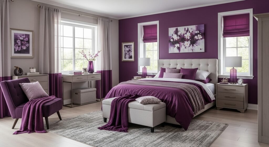
Step 1: Anchor the room with one confident purple piece
I start by choosing one main purple item—the duvet or a large throw—so purple reads deliberate. That single strong piece gives the eye a place to rest. The room suddenly feels purposeful instead of scattered.
People often try to pepper small purple items everywhere. The insight is that one anchor keeps the color cohesive. Mistake to avoid: using multiple competing purple shades at the same scale; that makes the room feel busy.
Step 2: Balance purple with warm neutrals
After the anchor, I add warm neutrals—linen pillows, a warm gray rug, a brass frame. These soften purple and make it feel modern. The visual change is immediate: the purple stops dominating and becomes part of a calm palette.
Most people underestimate the power of warm neutrals to calm a bold color. Insight: match undertones—if your purple has cool blue undertones, pick neutrals with cool greys. Small mistake: choosing stark white that creates contrast that feels clinical.
Step 3: Layer textures to keep purple cozy
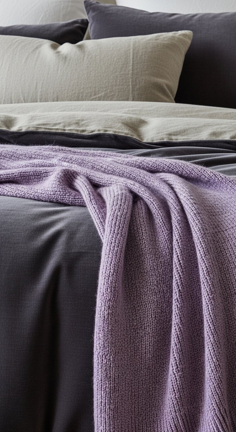
I layer textures—velvet, knit, linen—to add depth without more color. Texture is what makes a strong color feel lived-in. Visually, the bed reads rich and tactile rather than flat.
People miss that texture controls mood. Insight: vary scale—smooth velvet, chunky knit, and fine linen. Mistake to avoid: over-texturing with too many heavy fabrics; that can feel cluttered. Keep at least one light texture to breathe.
Step 4: Place art and accents with intentional spacing
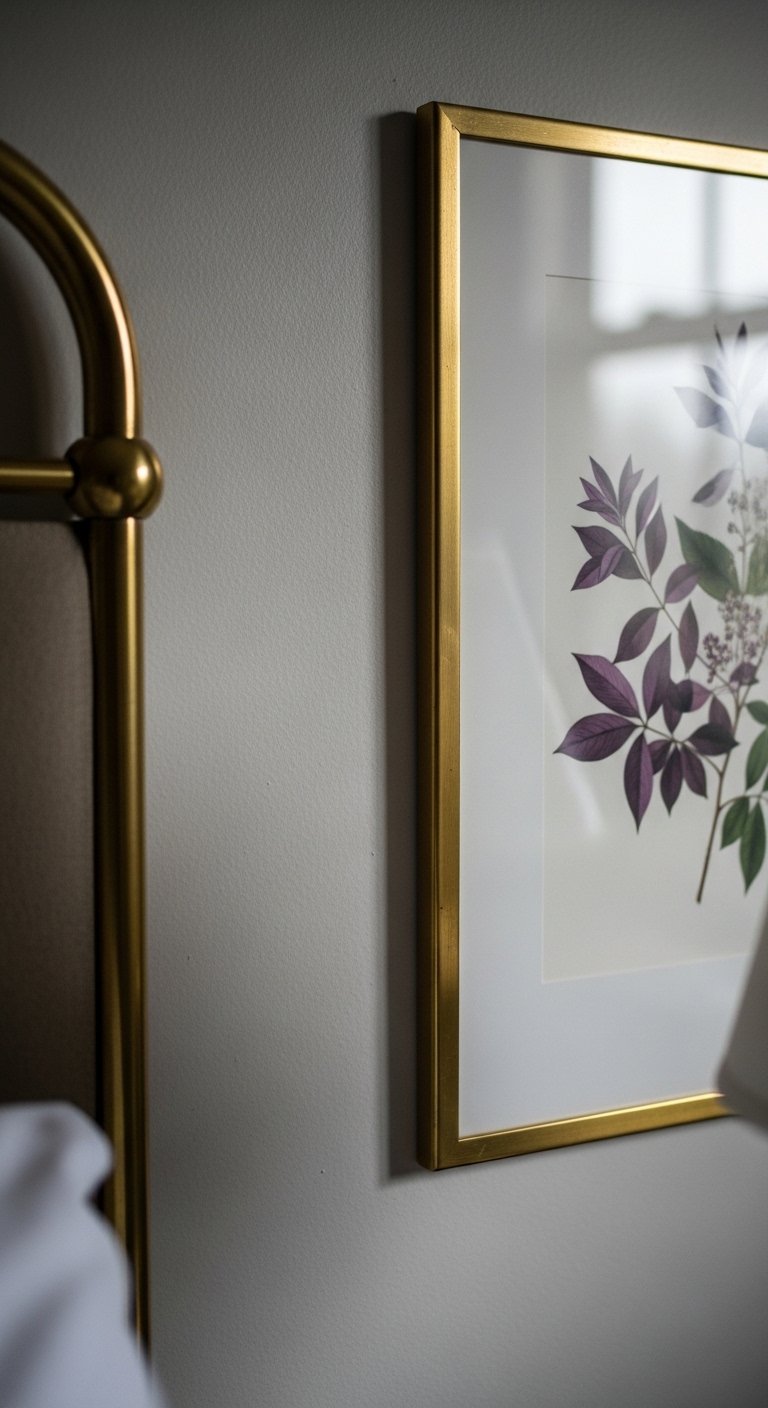
I hang a single piece of art or a small group that echoes the purple. I leave breathing room around frames so the color reads deliberately. The change: walls stop feeling like screens of color and start talking to the bedding.
An insight I learned is to mirror one purple tone in an accessory rather than matching exactly. Mistake to avoid: filling every wall with small frames; too busy versus one or two measured accents that create calm.
Step 5: Edit and fine-tune lighting and small details
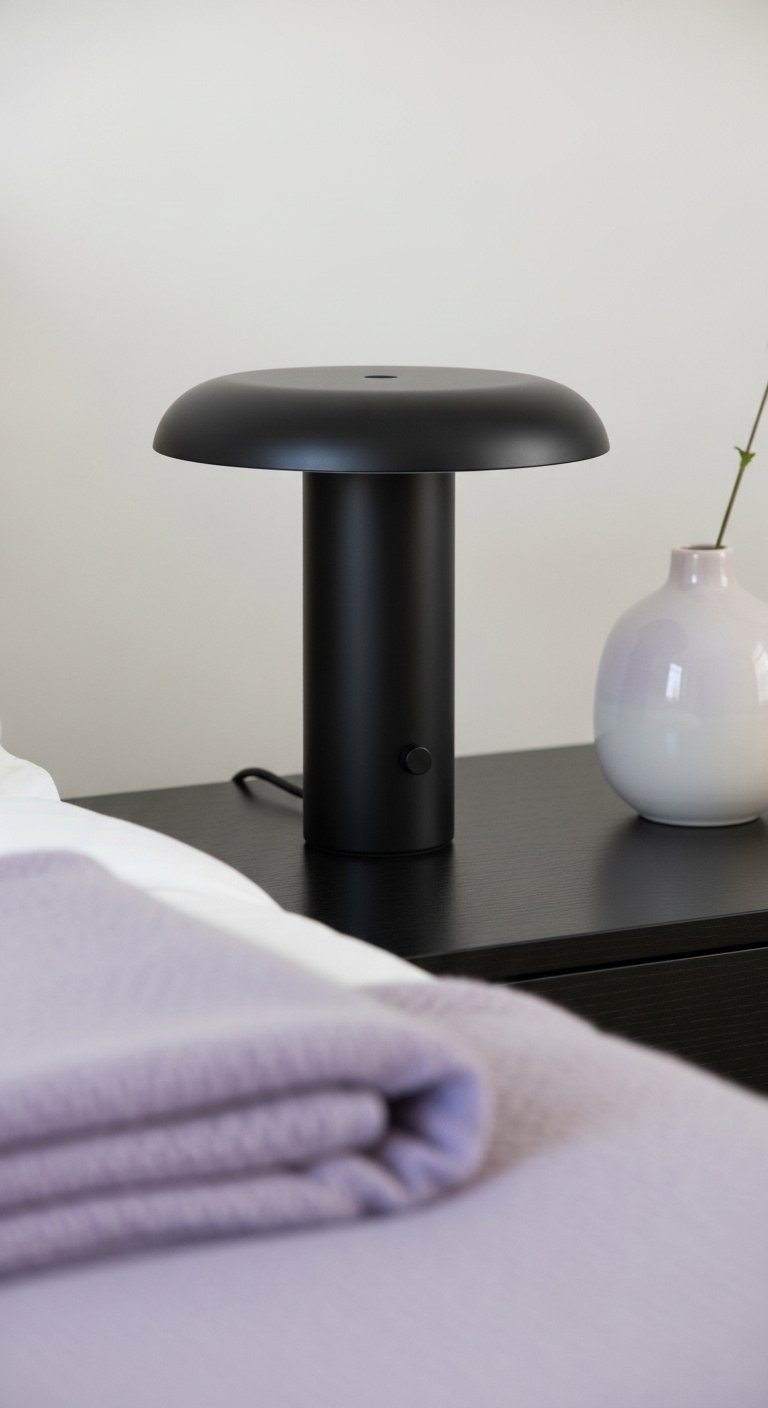
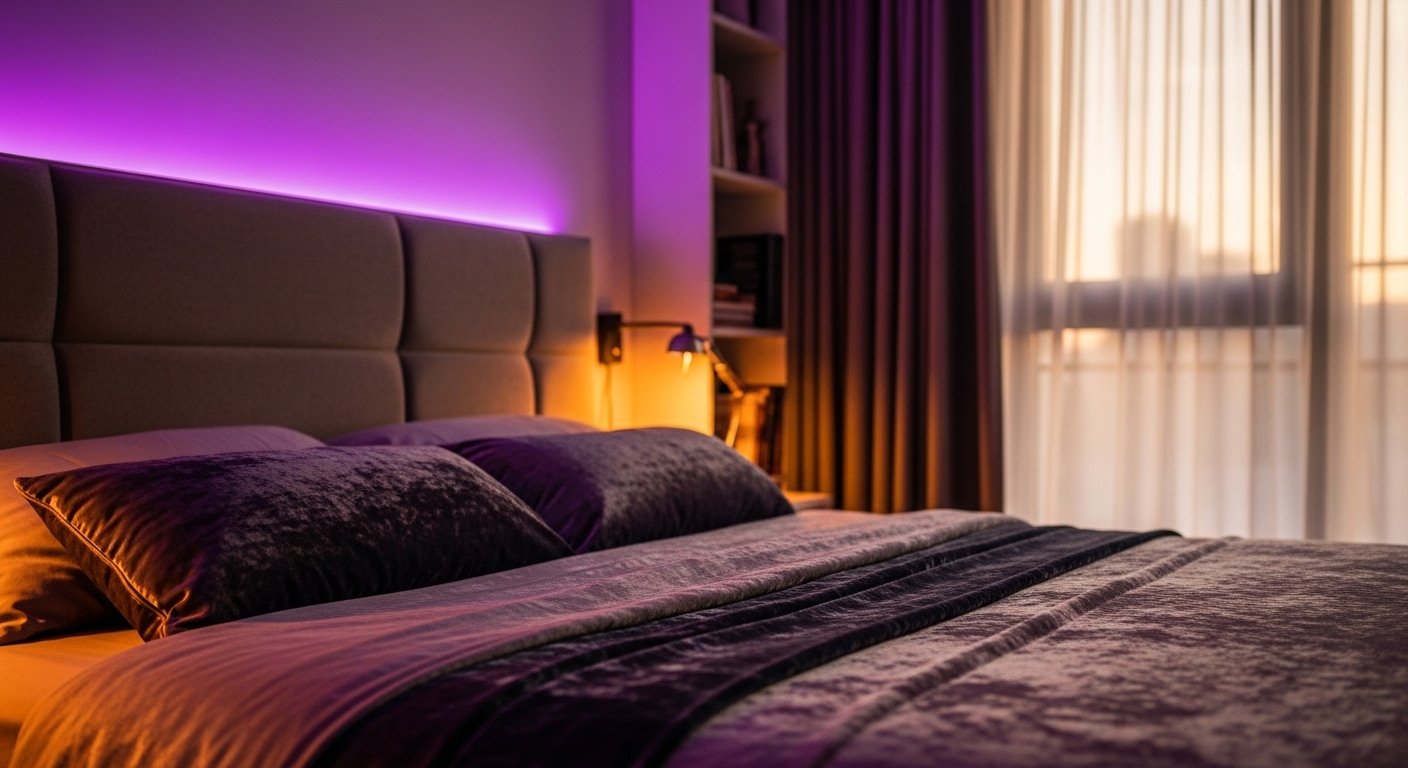
I dim harsh overhead light and rely on a bedside lamp to warm the purple. I add a small vase or a book to humanize the scene. The room shifts from staged to lived-in and comfortable.
People skip the editing step. Insight: live with the setup for a day and remove one item—chances are the room breathes better. Mistake to avoid: adding too many decorative objects; less often lands as more intentional.
Color Balance Guidelines
I keep purple as the hero and use neutrals to support it. If the purple is cool, I lean into cool greys and soft whites. If it’s warm, I use taupes and warm metals.
A simple rule: limit bold color to one large element plus one repeating small accent. That repetition ties the space together without overwhelming it.
Texture and Layering Notes
Think in three layers: base (rug, curtains), middle (bedding, pillows), top (throw, small accents). Each layer should differ in scale and material. Bulky knit next to smooth velvet feels inviting.
When in doubt, remove one pillow or one accessory. Rooms feel more intentional when there’s a rhythm, not a crowd.
Lighting and Mood
Natural light shows the true purple, so test in daylight. Use a warm bedside lamp for evening to keep the color cozy. Avoid bright cool bulbs that can make purple read muddy.
A dimmer or adjustable lamp helps you switch the mood without changing decor. Small changes in light change how purple feels more than most people expect.
Final Thoughts
Start with the purple piece you love and build around it slowly. Small edits—switching a pillow, moving a lamp—make a big difference. Trust what feels balanced in the room, not what looks loud in a photo. Begin with one confident choice and refine from there.